SnackPik
Mobile Shop UX/UI and Prototype
UX Course Project · 2023
SUMMARY
SnackPik is a conceptual snack ordering app for theatergoers designed in a five-day Design Sprint cycle, following Google's UX Coursera process taught by Google professionals.
Goals
- Expand My UX Portfolio: To enhance my catalog of released projects and demonstrate my versatility as a UX/UI designer and developer.
- Learn New Tools: To gain proficiency in using Figma and related UX design tools.
- Real-World Application: To create a practical solution for theatergoers, aiming to reduce their inconvenience and improve their overall movie-watching experience.
- User-Centric Design: To understand user needs and frustrations, thereby developing an app that addresses these issues effectively.
Empathy
We begin the process by putting ourselves in the shoes of our users to understand their needs, problems, and motivations.
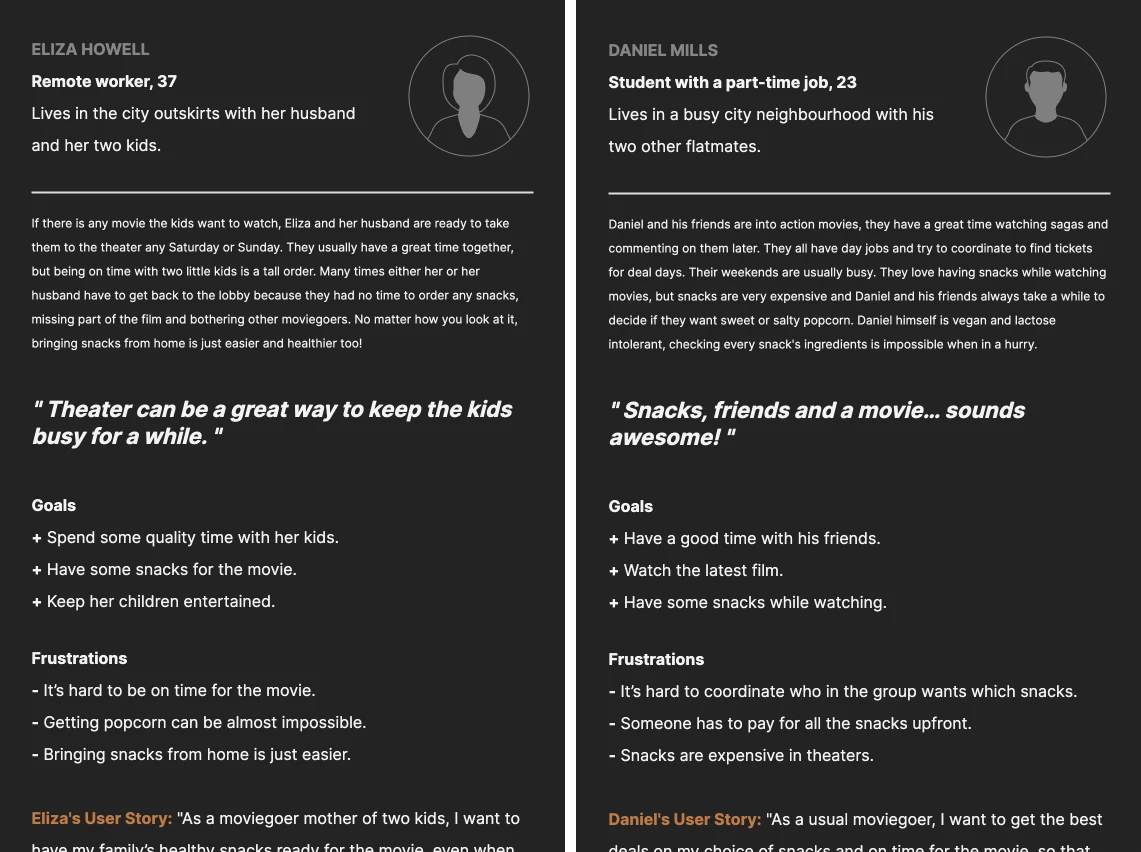
User Personas
Eliza Howell: A 37-year-old remote worker and mother of two. She visits the theater on weekends with her family and struggles with the logistics of buying snacks without missing the movie.
Daniel Mills: A 23-year-old student with a part-time job. He and his friends enjoy watching action movies and often find it challenging to coordinate and purchase snacks due to dietary restrictions and budget constraints.
Define
Problem targeting
Based on the findings from the empathy phase, solutions were generated to eventually lead to a testable wireframe prototype.
- Problem statements: A clear and concise description of the core issue users are facing.
- Hypothesis statements: Guessing about the cause of the problem and how a potential solution might address it.
- Competitive audit: An analysis of how direct and indirect competitors are tackling similar user problems.
- Goal statement: A clear and measurable objective that the UX solution aims to achieve.
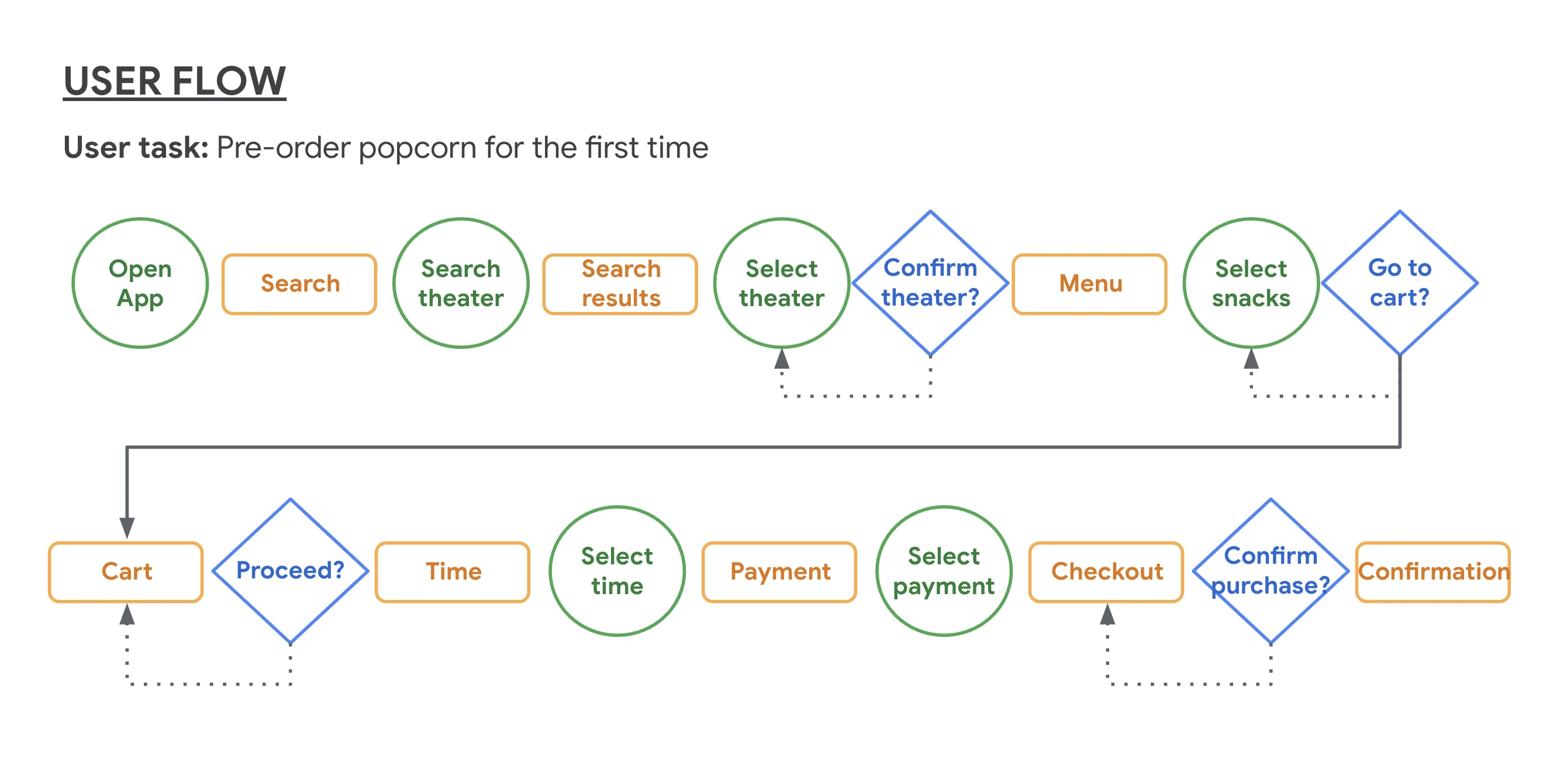
User Flow
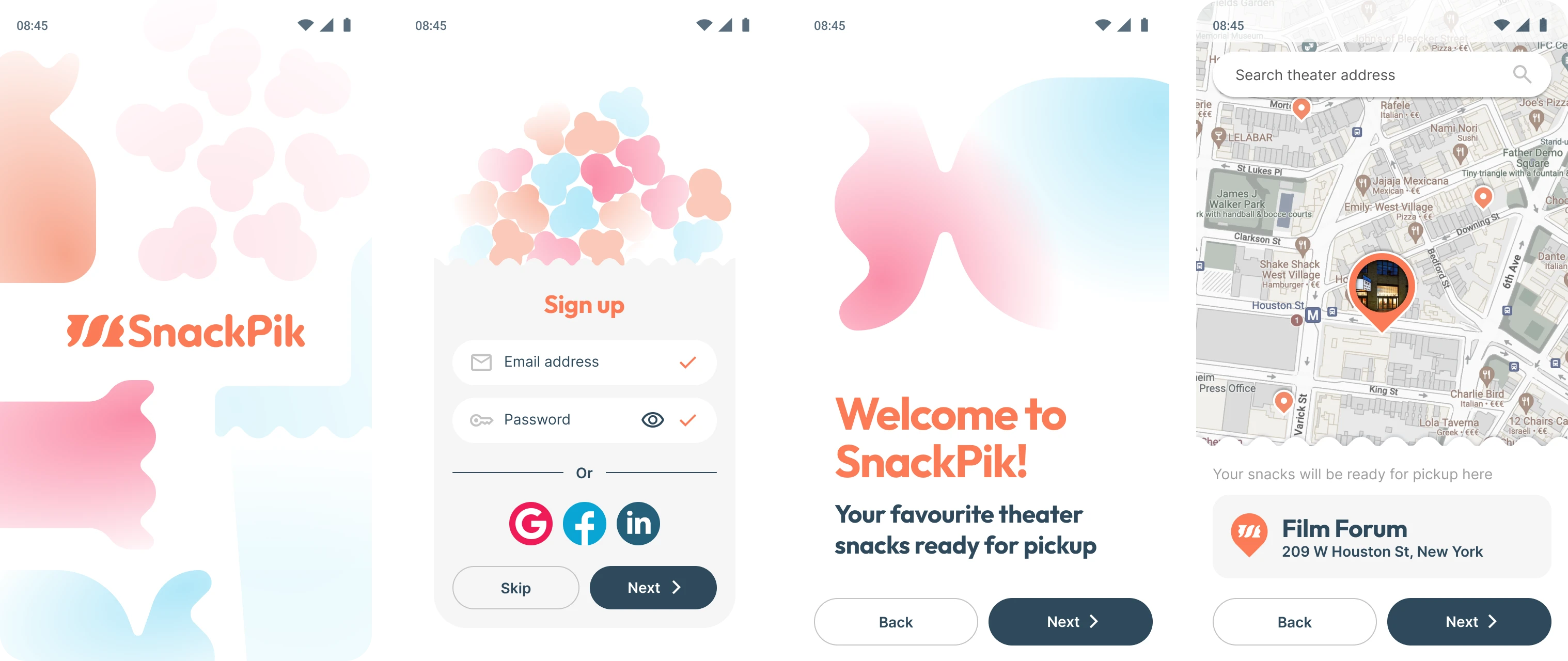
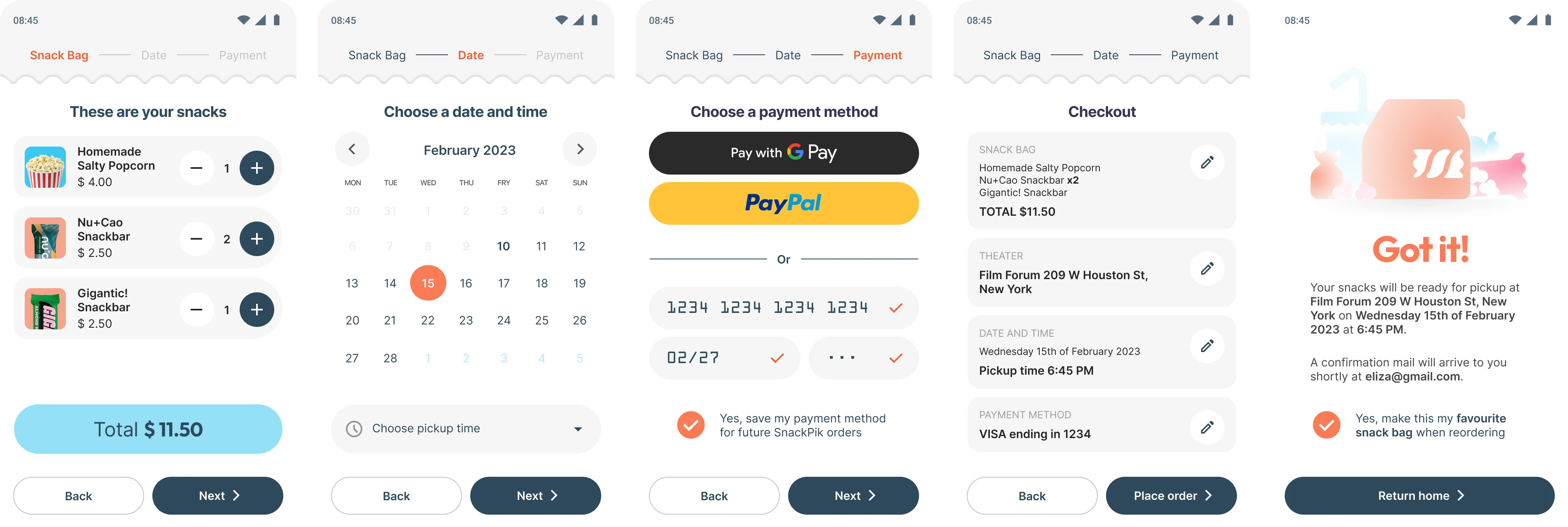
The user flow for SnackPik is designed to be intuitive and straightforward, minimizing the steps required to order and pick up snacks.
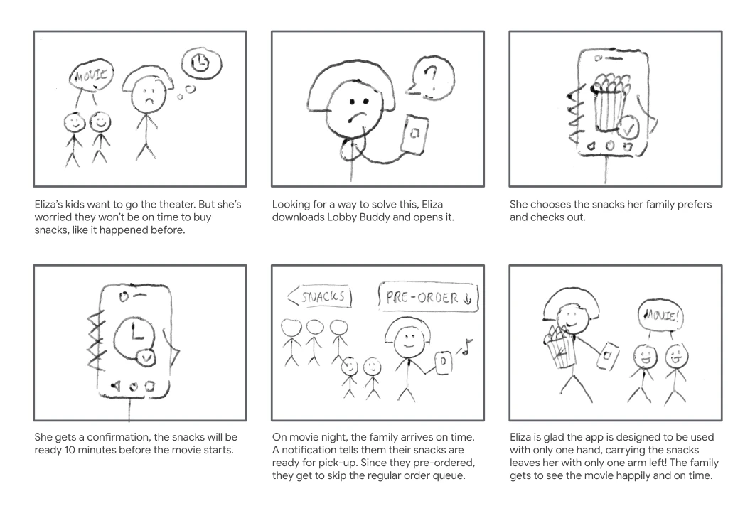
Storyboard
To better describe and explore the user’s experience with the app, two storyboards were produced. The first one focused on what the user needs, her context and why the app will be useful.
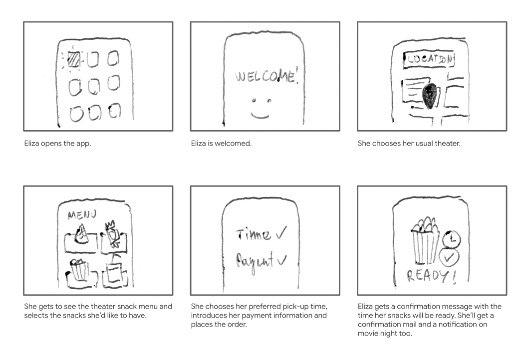
The second storyboard focuses on how the app would work.
Ideation
Brainstorm
Options to organize the information that would show on the app's main screens were sketched rapidly to consider many different outcomes.
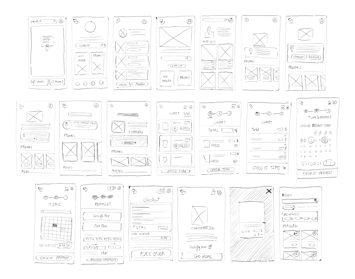
Wireframes
Wireframes of the best options that came out of the brainstorming process were made along with a MVP prototype to begin the testing process as soon as possible.
Prototyping
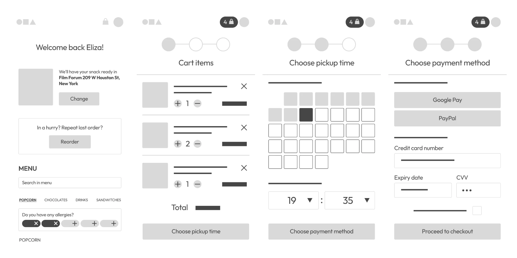
Medium Fidelity Mockup
After running the test and gathering insights and pain points a more visually accurate version of the prototype was made focusing on very basic design aspects, like adding all the information the wireframes were missing, adding pictures and colour to create a coherent visual hierarchy and applying changes to the app's behaviour to correct the pain points spotted during the testing.
Validation
Usability Test
Five users were involved in usability testing, performing tasks such as creating a profile, setting a preferred theater, adding/removing items to the cart, and completing the checkout process. Feedback indicated that:
- The cart icon was not easily noticeable.
- Users were unsure if items were successfully added to the cart.
- The account creation process should be optional initially.
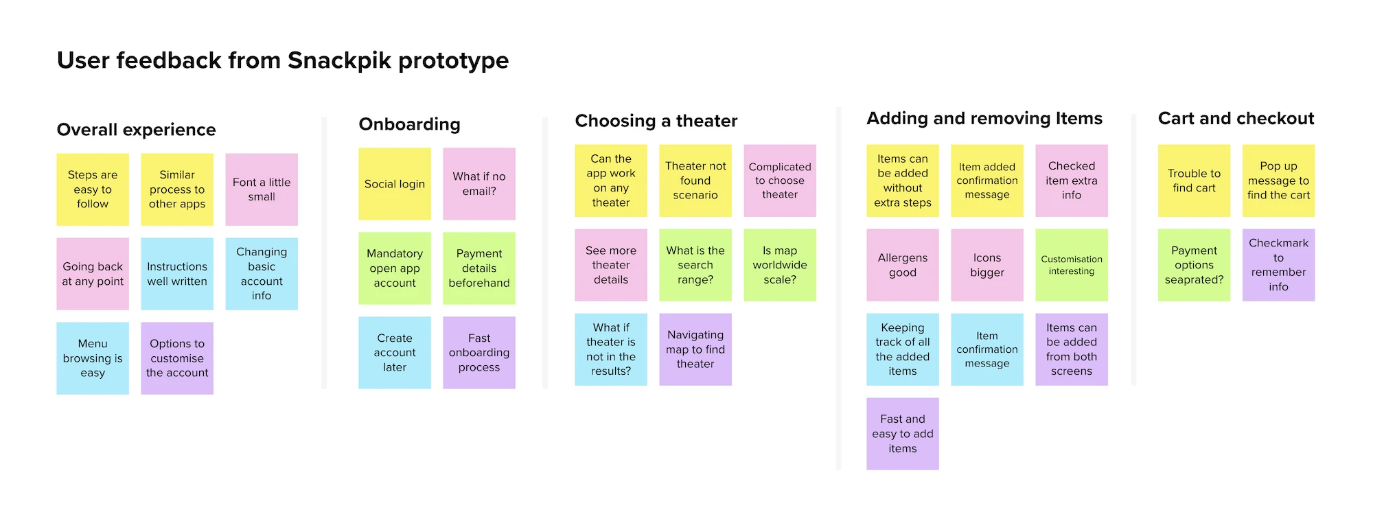
Affinity Diagram
With the information gathered from the test,an affinity diagram was built to find other common themes and pain points to work on to improve the app's experience design.
Iteration
The insights from user testing guided the last phase of development.
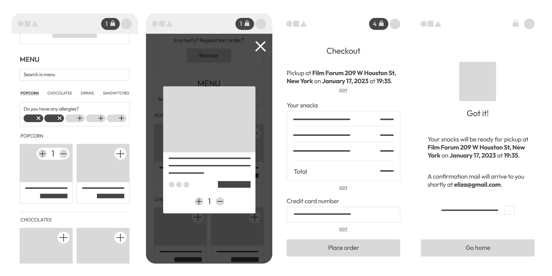
Design System and Scalability
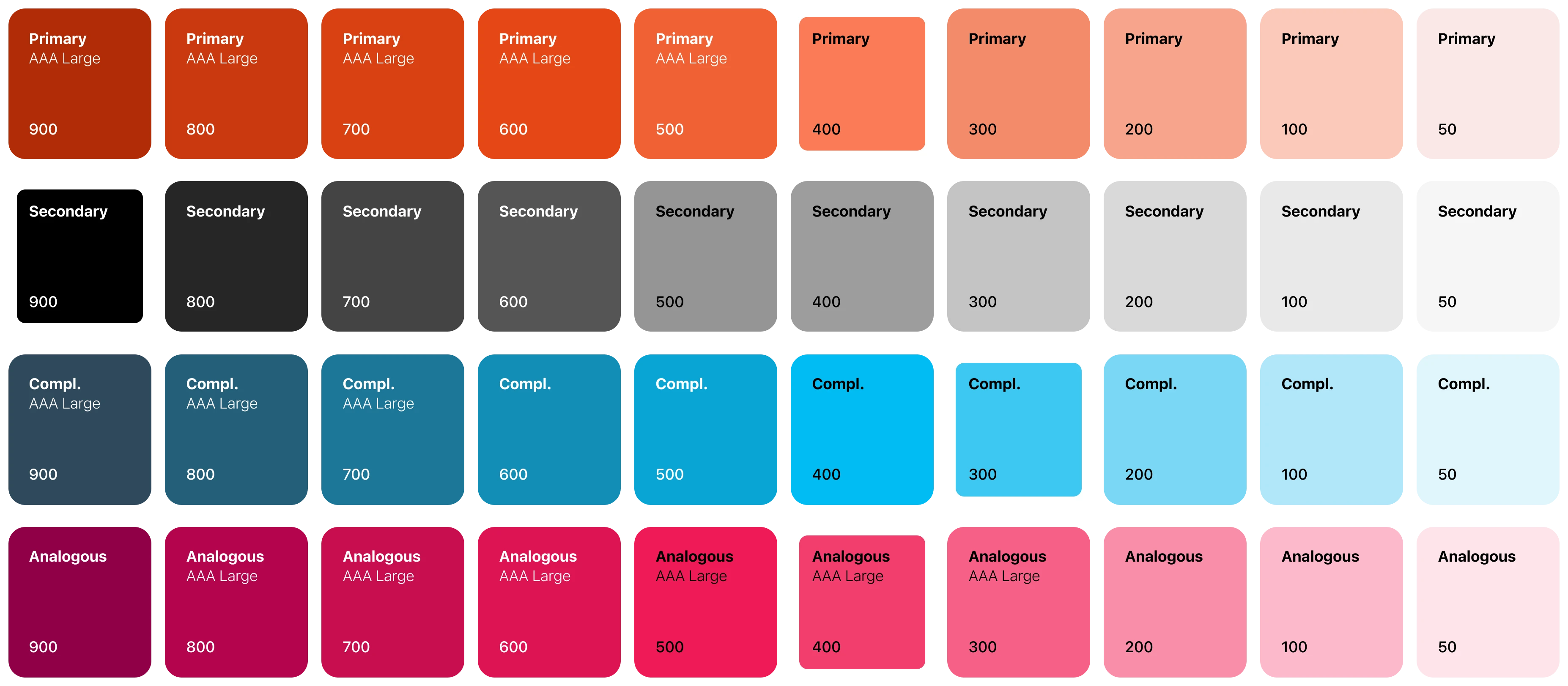
Once every necessary element of the layout was present in the desing, a final version was made based on a desing system and scalability considerations.
Color Palette: The primary colors are orange and dark blue, chosen for their contrast and ability to draw attention to key actions and components. Orange signifies optimism and positivity, while dark blue offers a professional and trustworthy background.
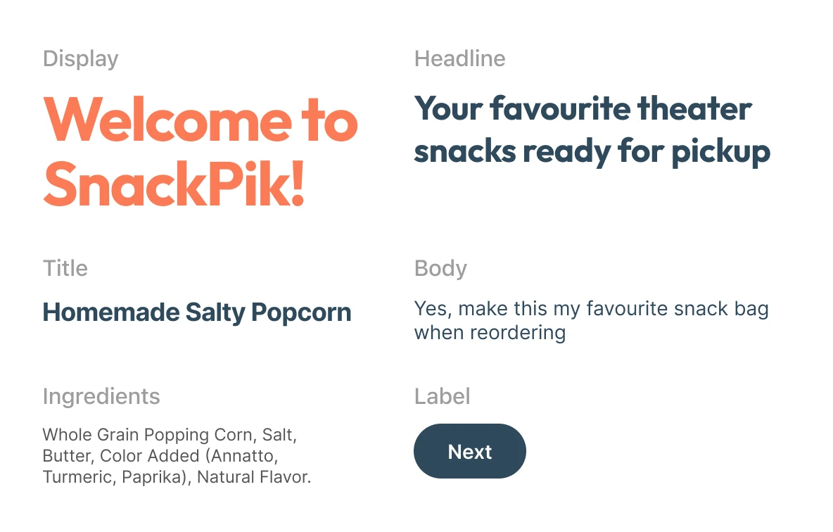
Typography: The fonts Outfit and Inter were selected for their readability and geometric design. Outfit is used for display text and headlines, while Inter is used for smaller text, ensuring clarity across different screen sizes.
Accessibility: The color contrast ratios and font sizes were chosen to make the app accessible to colorblind users and those with visual impairments.
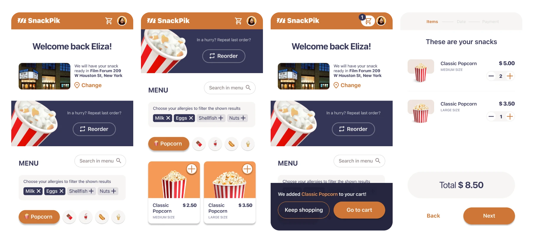
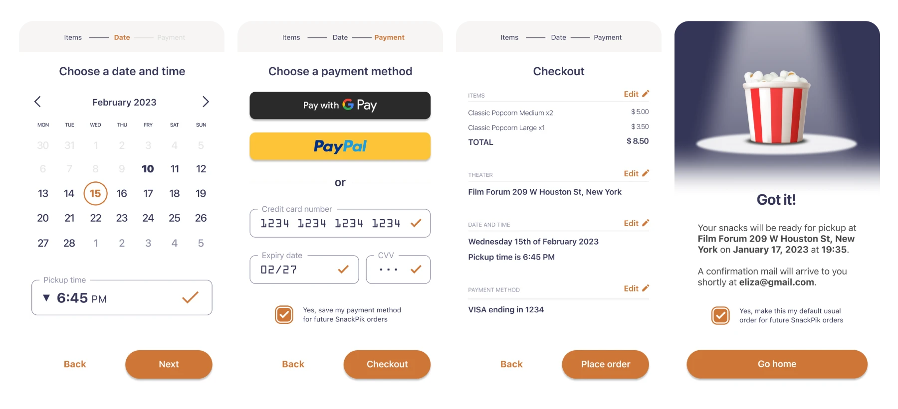
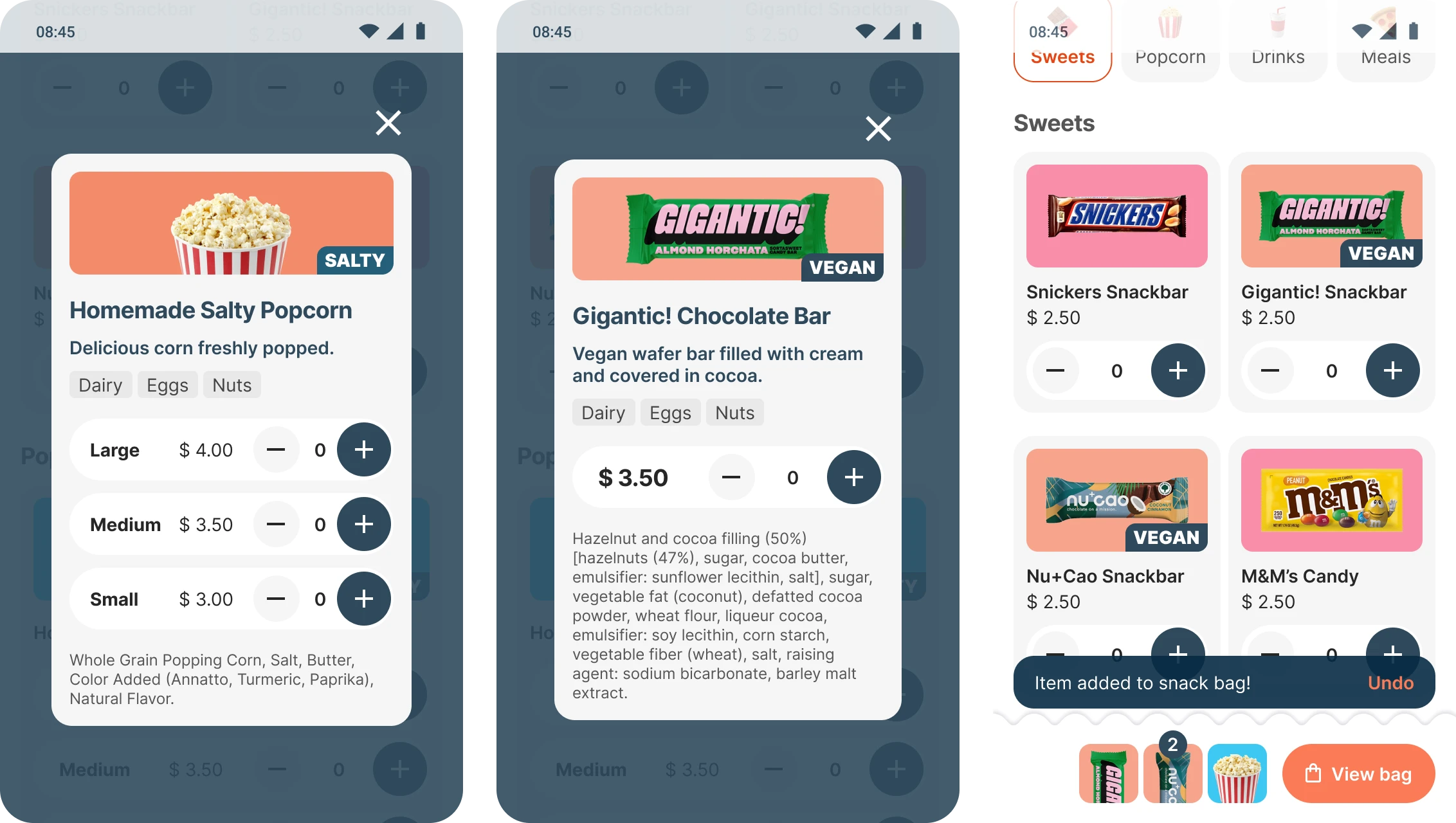
High Fidelity Mockup
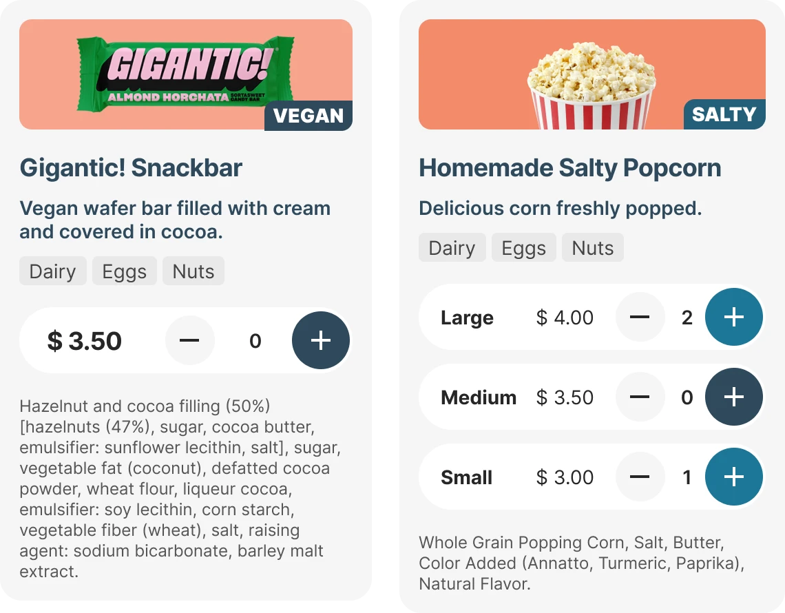
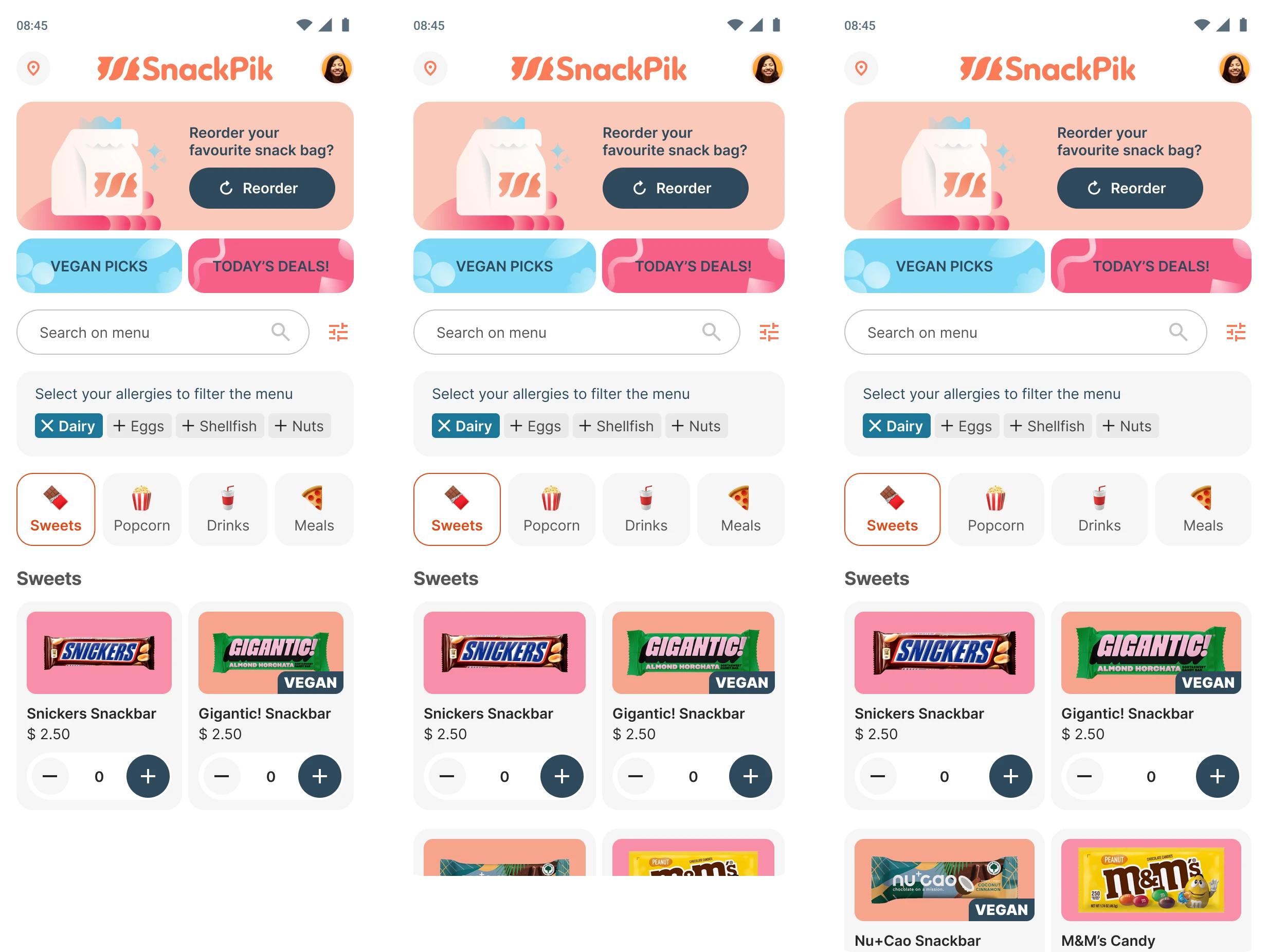
Simplified Navigation: The main menu is the central hub, allowing users to easily browse and filter snacks. Key actions like adding items to the cart and viewing allergen information are prominently displayed.
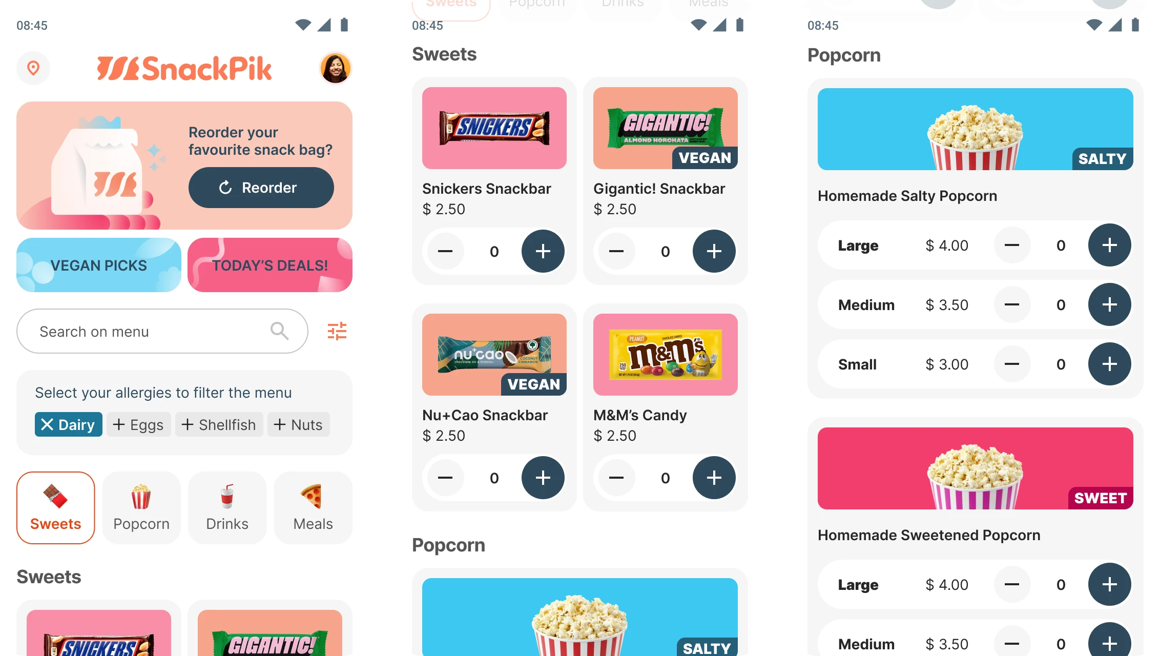
Responsive Design: The app is designed using Auto Layout in Figma, making it adaptable to various screen sizes and ensuring a consistent user experience across different devices.
User Feedback: Popup messages and visual cues confirm actions like adding items to the cart, ensuring users are always aware of their selections and order status.
Conclusion
Working on SnackPik has been an invaluable learning experience. It has not only enhanced my skills in UX/UI design but also provided practical insights into user-centric design. The project showcases my ability to create solutions that address real-world problems, ensuring a better experience for users.
Surbeeval
Previous project
Battledump
Next project
LET'S TALK! ✨
I'm currently seeking new opportunities! Let me know if my skills could be a good fit for your team.
MAIL ME